


Ordering embroidered scrubs for the first time? It’s easy to feel overwhelmed by questions. How big should the logo be? Where does it go? Will your detailed design even work? Making the wrong choice can lead to a costly, unprofessional result, but getting it right is simpler than you think.
Your team's scrubs are more than a uniform; they are a key part of the patient experience. A crisp logo on custom-branded medical uniforms conveys competence and trust from the moment a clinician enters the room. Research suggests that professional attire serves as a visual indicator of competence, significantly enhancing patient confidence.
This guide demystifies the process by focusing on the three choices that matter most: Placement, Size, and Design, providing simple rules to help you order custom logo scrubs that look sharp and build patient confidence.
Professional Logo Placement on Medical Uniforms
Deciding where to put your logo might seem like a small detail, but it’s crucial for making a professional first impression. The right placement ensures your branding is clear, visible, and doesn't get in the way of a busy workday. For custom embroidered scrubs for medical staff, there is a clear and trusted standard.
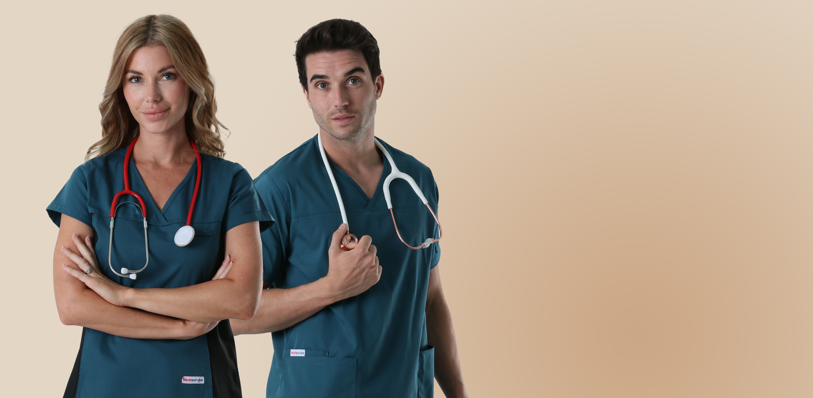
Industry Standard: The Left Chest
For a classic look that’s immediately recognisable, the left chest is the industry-standard placement. There’s a simple reason for this: it’s the most visible spot during face-to-face patient interactions, reinforcing your clinic's name and building trust. Placing it here keeps it clear of ID badges often clipped to a central collar or pocket.
Alternative Placements for Modern Clinics
While the left chest is the top choice for a primary logo, a couple of other spots work well for a modern look or for secondary information:
- Sleeve (Left or Right): Offers a subtle, contemporary style, perfect for a secondary icon or a practice sub-brand.
- Back Yoke (Below the Collar): Ideal for displaying the clinic’s full name or website in larger text that’s visible from behind.
Once you’ve picked the perfect spot, the next question is just as important: how big should it be?
The 'Credit Card' Rule for Perfect Logo Sizing
After choosing the placement, dialling in the right size is the next critical step. For a standard logo on the left chest of medical scrubs, the professional sweet spot is a width between 3.5 and 4 inches. This range is large enough to be clearly visible and legible during patient interactions but small enough that it doesn’t overwhelm the uniform.
An easy way to visualise this without a ruler is to use our “credit card rule.” Simply hold a standard credit or business card horizontally against the chest of a scrub top. That width is the perfect real-world guide for how much space your logo should occupy. It creates a balanced, polished look that feels intentional and high-end.
Resist the temptation to stray too far from this standard. A logo that’s too small (under 3 inches) will cause important details and text to become a blurry, unreadable mess of thread. On the other hand, an oversized logo can look more like a billboard than a professional emblem.
Optimising Your Design for Embroidery
A logo that looks fantastic on your website or a business card is designed with ink, which can produce infinite detail. Embroidery, however, uses physical thread, which has thickness and limitations. Understanding these differences is the key to ensuring your digital design translates into a crisp, professional embroidered emblem.
Simplifying Colours and Gradients
One of the most common hurdles is gradients, or smooth colour fades. Because a needle uses one solid colour of thread at a time, it can't replicate a subtle fade from light blue to dark blue. For embroidery, these gradients are simplified into distinct blocks of solid colour. This change ensures a clean, bold look rather than a messy and confusing jumble of stitches.
Ensuring Legibility for Text and Fine Details
Similarly, the physical thickness of the thread makes tiny details a major challenge. As a rule, any text on your logo must be at least a quarter-inch tall to be legible when stitched. Trying to embroider anything smaller is like trying to write your clinic’s name with a thick marker on a postage stamp—the letters will blur together. The same applies to very thin, delicate lines in your design, which often need to be thickened so they don’t get lost in the fabric’s texture.
These adjustments might sound complicated, but they are standard practice and crucial logo design tips for embroidered apparel. Your embroidery partner will handle these conversions for you during a critical one-time setup process called "digitising."
Understanding Digitising and Setup Fees
After you approve the design adjustments, the next step is a crucial process called digitising. This is where an embroidery expert manually rebuilds your logo file into a digital blueprint that an embroidery machine can read. It’s not an automatic file conversion; think of it as a skilled artist translating your image, stitch by stitch, into a set of instructions.
That manual craftsmanship is why most embroiderers charge a one-time setup fee for a new logo. This fee doesn't cover the scrub embroidery cost per item; instead, it pays for the expert's time to create this permanent stitch map. It’s a one-and-done investment. For all future orders of men's scrubs or women's scrubs using the same logo, you won't need to pay this fee again.
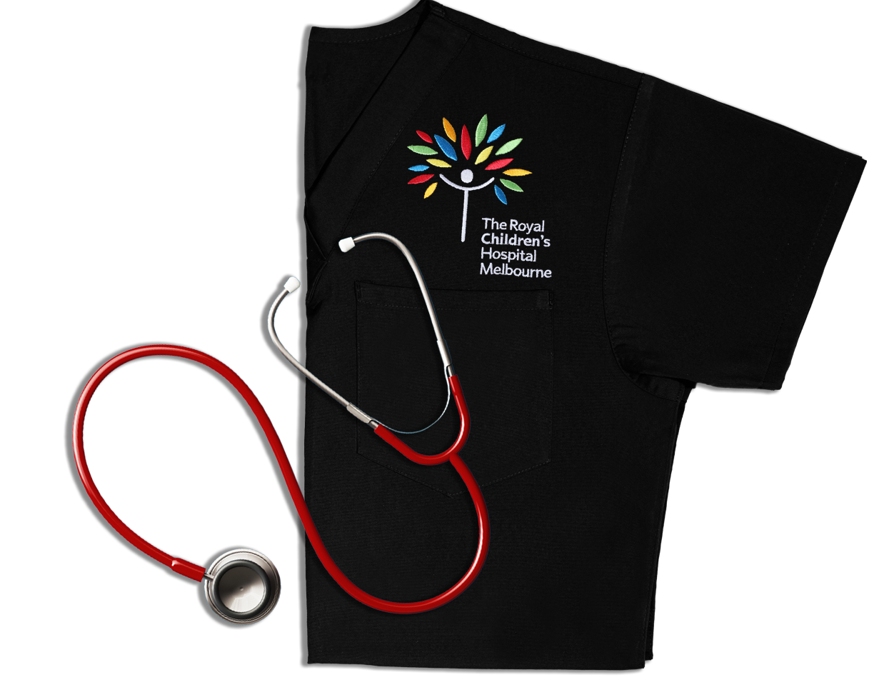
Embroidery vs. Screen Printing: Why Quality Matters
You might see screen-printed logos on event t-shirts and wonder if that's an option for your scrubs. While screen printing has its place, embroidery is the gold standard for medical environments.
Screen printing applies a layer of ink onto the surface of the fabric. This works for casual wear, but it simply isn't designed to withstand the harsh, high-temperature laundry cycles required for medical sanitation. Over time, that ink will inevitably crack, peel, and fade. In contrast, an embroidered logo is stitched directly into the garment, creating a design that is as durable as the scrubs themselves.
Professional healthcare organisations, such as HCA Florida, often mandate embroidered logos precisely because they maintain a consistent, recognisable, and professional appearance through heavy industrial laundering.
Adding Names and Titles for a Personal Touch
Adding a name and title transforms a branded uniform into a personal introduction. The standard approach is to place the text directly below your logo on the left chest. Alternatively, you can place the name and title on the right chest for a more balanced layout.
For the font, clarity is king. To ensure your medical staff look sharp, always choose a simple, clean block font (like Arial or a similar style). This guarantees every letter in your staff's names and credentials is crisp and projects the utmost professionalism.
Selecting the Best Scrub Fabric for Embroidery
While design and placement are crucial, the fabric of your scrubs acts as the canvas. Not all materials handle dense stitching equally well.
- Polyester/Cotton Blends: These are the industry gold standard. They offer a sturdy, tight weave that provides a stable foundation for the thousands of stitches in your logo.
- Performance/Stretch Fabrics: Extremely lightweight or very stretchy fabrics can present a challenge. The tension from the embroidery process can sometimes cause “puckering”—unwanted wrinkling of fabric around the edges of your logo.
To ensure a flat, professional finish, it is best to contact your uniform provider to confirm which collections are best suited for high-density embroidery.
Your 5-Step Checklist for a Flawless Scrub Order
You’re now equipped to prevent common, costly mistakes. This simple checklist is your final tool to guarantee a professional result:
- Finalise Placement & Size: Left chest is standard; aim for 3.5-4" wide.
- Simplify Your Logo: Use solid colours and ensure text is at least 0.25" tall.
- Provide High-Quality Files: Give your embroiderer a vector file (.AI, .EPS, or .PDF) if possible.
- Confirm Name & Thread Colours: Choose high-contrast thread for maximum readability.
- ALWAYS Approve the Sew-Out Sample: Request a photo of the stitched logo before full production begins.
With this framework, you’re ready to outfit your team in custom logo scrubs that look sharp, build patient trust, and perfectly represent the quality of your care.


